History
3011 Exercises
1. Navigating IPUMS Documentation
(work in groups)
a.
IPUMS-USA
has three variables that identify each individual’s occupation, occupation, and
three that identify industry. What are
those variables?
b.
What
is the difference between Occupation and Industry?
c.
What
variable would be best for comparing occupations across the period from 1850 to
2010?
d.
What
is the difference in the universe for occupation between 1850 and 2012?
e.
Read
the instructions to enumerators or respondents for 1850 and 2012. Do you see
any differences that might affect responses?
f.
How
many farmers does IPUMS have for 1850? For 2012?
g.
The
current IPUMS sample for 1850 has 197,796 cases, and the 2012 sample has
2,113,030 cases. What is the percentage of cases listed as a farmer in each
sample?
2.
First IPUMS Analysis (work in groups, but each student must do the
analysis on their own machine)
a.
Go
to the IPUMS documentation and browse the variable RELATE
b.
Download
the MN1880-2010.sav file here
c.
Click
on file to open SPSS
d.
View
data window
e.
Open
a new syntax window, and enter “FREQUENCIES YEAR.” (Do not include quotes. Be
sure to include the period.)
f.
Run
the command by selecting run all from the toolbar.
g.
Look
at results in output window.
h.
Go
to syntax window and type the command: “CROSSTABS YEAR BY RELATE/CELLS ROW.”
(Do not include quotes. Be sure to include the period.)
i.
Run
the command
j.
How
did RELATE change between 1850 and 2010? What might have caused these changes?
k.
Share
your syntax file and your speculations with me on Google Drive.
3. Social Explorer
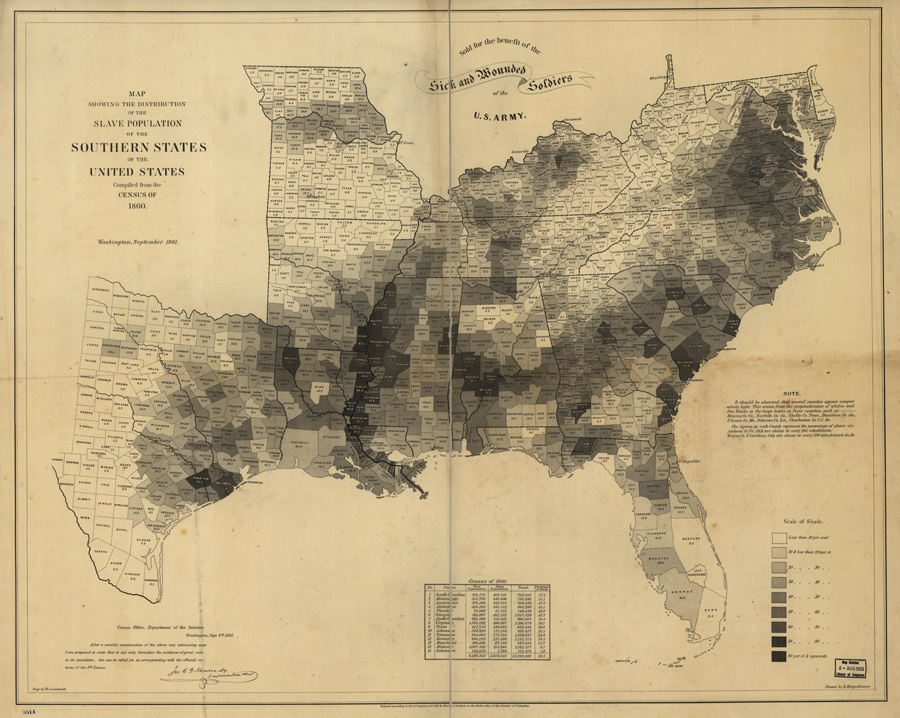
The
following is a famous map showing the distribution of the population living in
slavery at the time of the 1860 census, taken from the Library of Congress'
American Memory digital
collection. (You can read about this map in a New York Times article.)
For this exercise, we will recreate this map as a slideshow from 1790 to 1860,
using census data in Social Explorer.
- From the Social Explorer
homepage, select the Maps & Tables tab, then click on "Start
Here."
- Click on the Data Selection
tab to open the data selection menu, and click on "Browse by
Survey."
- Use the "Survey"
drop-down list to select "Census 1790."
- From here you can change the
topic and specific variable using the drop-down menus. Under Table, select
"T10: Slave Status," and then select the variable "Slave
Population."
- Click of “show data by” and
change from “state” to “county”
- Change the colors to your
liking.
- Zoom in to focus on the areas
of slavery, leaving room for Westward expansion
- Click on snapshot, on the
lower right
- Repeat for Census 1800-1860,
saving each snapshot in turn
- Save as PowerPoint slides.
Click on the Export button next the search box in the upper right, then
select PowerPoint and Prepare for Download.
- Save the PowerPoint in the
shared folder
4. Formatting tables
1.
Download the file
USA_140years.sav located on the HIST
3011 google drive.
2.
Load the data into
SPSS.
3.
Select women (SEX=2) of
a particular age group. Make sure the age group is within the universe for
LABFORCE in all years. Other than that constraint, you can pick whatever age
group you want (e.g. women 18-64, or women 20-29, or women 45-54).
4.
Make a crosstab of YEAR
by LABFORCE (do not use weights or percentages).
5.
Turn on the weights
(WEIGHT BY PERWT).
6.
Do the same crosstab,
but turn on row percents and turn off counts (/CELLS
ROW).
7.
Copy the table into
Excel, pasting as text.
8.
Format the table for
publication. Provide an informative title, good labels on rows and columns, add
the unweighted number of cases (from your first
crosstab) for each percentage, get rid of gridlines, provide
a source note on the bottom. Make it beautiful! (you
can mess with this at home if it is taking too long to do in class).
5. Calculating
Durations with Synthetic Cohorts
A. Make an Extract with IPUMS-USA
1. Choose a 1% sample of a census year before 1950.
2. Select these variables: relate, age, sex, race, school attendance (SCHOOL),
birthplace (BPL), birthplace of mother (MBPL).
3. Exclude the foreign born using the select cases feature.
4. Set the output format to spss (.SAV).
B. Run your analysis in SPSS.
1. Decompress your SPSS .SAV data and open it in SPSS by clicking on
it.
2. Open a new syntax window.
3. Open the IPUMS codes for father’s birthplace.
4. Recode MBPL (mother’s birthplace) into no more than 5 categories. All
categories should have at least 10,000 cases. Keep in mind that in most years there
were very foreign born outside Europe.
5. Make a VALUE LABELS statement to label each recoded MPBL category.
6. Select persons of school age (e.g. 5-22).
7.
Use the crosstabs
command to get the proportion of people in school at each age. Your command
should look something like this:
CROSS AGE BY SCHOOL BY RECFBPL/CELLS ROW.
C. Calculate Mean years of schooling using
Excel.
1. Copy your table into Excel.
2. For each father’s birthplace group, sum up the proportion in
school at each to get the mean years of schooling.
3. Format the results into a beautiful labeled table.
4. Upload the beautiful table along with your SPSS syntax file to your
shared google drive.